Wondering what’s the best type of MLB uniform. In terms of looks or even aesthetics? What’s the best type of uniform out there with the best style and design?
Well, not to worry I have compiled just the list for you and in this article, you’re gonna find just the right thing.
So without further ado, keep reading and enjoy this ranking!
The Best MLB Uniforms
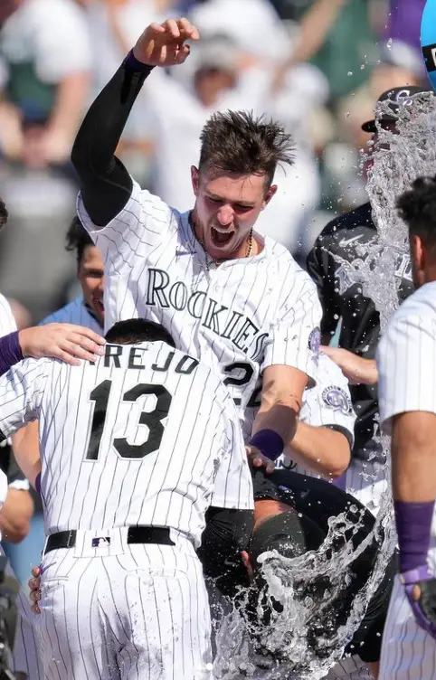
30. Colorado Rockies
Well, there’s not much to say about the Colorado Rockies, but I find that their uniform is super simple to look at. Technically their pattern is too simple and everything else is simple with it as well. I mean they have the common stripes and nothing else, to be honest. So, I think this didn’t click much with me and I found this the least appealing to be very honest.
Source: Instagram
I mean the pinstripes are something but it just feels too boring and super old school you would want to see something interesting and also something that you’d want to buy as well. But this simple design just won’t cut it honestly. So the Colorado Rockies is not something that I was personally attracted to and something that didn’t meet my eye.
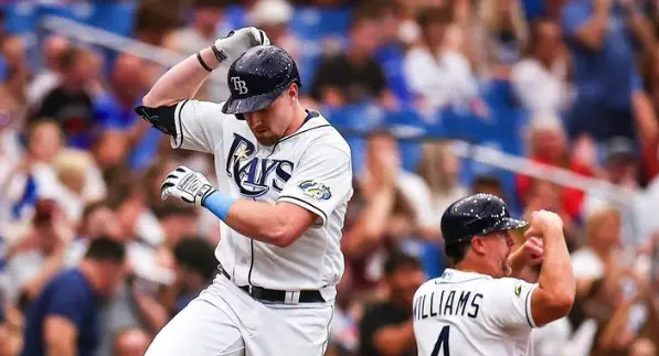
29. Tampa Bay Rays
To be very honest just like the colorado rockies I find that the Uniform is generally super plain and way too simple, like it doesn’t have too much pop of color or anything that stands out. They just have the team’s name across the front and there’s nothing that stands out in particular. Therefore I find it pretty boring and just too plain to my liking. The Tampa Bay Rays, it is great, but nothing super catchy once again, they are way too simple. They are just something you wouldn’t be like “yea I’d buy that”. It’s too simple without any pop color, just boring honestly, and very plain as well. So yup that’s why Tampa Bay is placed here in the second-last position.
Source: Instagram
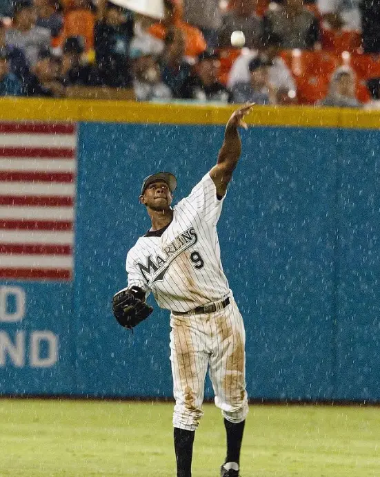
28. Miami Marlins
Once again just a super clean type of look with a bold team name on the front of the jersey. So they are pretty great, but once again they are not something I’d like in terms of aesthetics or even style for that matter, it’s something that you’d just look at once and be like “Meh! They are fine”. Once again a simple look isn’t gonna cut a yes from me, it’s too boring, nothing that you would want to buy in just an instance if you see it, you know. It’s great and all with the team name on the front, but hey isn’t that what a lot of team associations do in general?
Source: Instagram
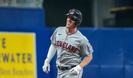
27. Cleveland Guardians
The Cleveland Guardians also don’t have anything crazy going for their design. They have similar designs to the above ones and they are just too simple and they are not that eye-catching honestly so I’m not a real big fan of it. They are just something that you’d look at like “yea that’s any type of baseball team”. I do love the ‘C’ baseball cap though for a touch. That’s the only thing that makes the entire outfit stand out, I mean the separate elements sort of twist it and give it a more standout than most of the uniforms, but once again not what I’d like honestly. They are just simple once again, and nope not anything unique that you’d want to see when buying a jersey for yourself. But once again it wouldn’t be the best MLB uniform.
Source: Instagram
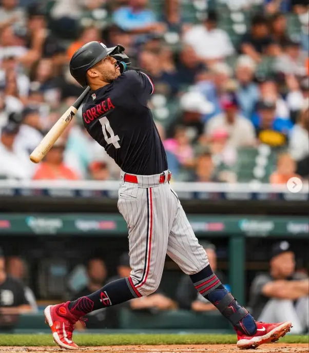
26. Minnesota Twins
So the next is the Minnesota twins, once again not anything super catchy about the uniform in general. It looks like a super common baseball uniform, not anything that would be like “Oh wow! This is such an extraordinary uniform”. No, it’s something super ordinary and they don’t have anything crazy going on with it as well. Okay, but I’ll be honest the baseball caps are actually super eye catchy honestly, I mean that’s some really top-notch design. It looks super good if you carefully and yes you might want to just buy the baseball caps but hey that’s not the point here. You want to look at the jersey as a whole and not just having the cap won’t help. So yup maybe not the best uniform once again.
Source: Instagram
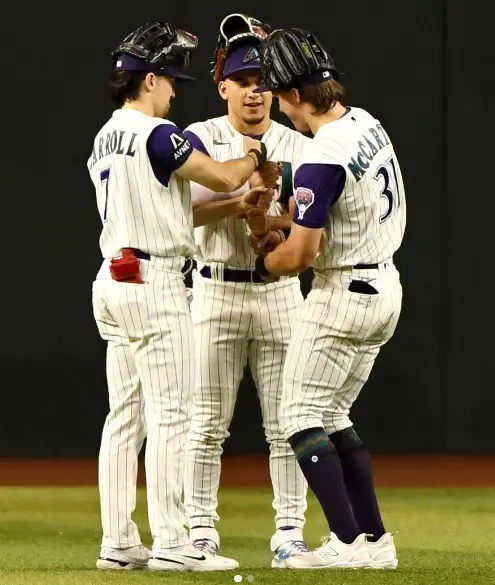
25. Arizona Diamondbacks
Well next is the Arizona diamondback, now the reason why I kinda placed them a little higher than most is because I like the touch of the red shirt and then the white baseball pants. The baseball cap also adds to the uniform and gives it a much better look overall and therefore makes it more catchy overall honestly. So the Arizona Diamondbacks, because of their redshirt jersey, really added a touch of flair to their MLB baseball Uniform. The redshirt kind of stands out if I’m being honest and if you are gonna look at it, that pop of color really gives it everything it needs, if you were to buy a baseball jersey.
Source: Instagram
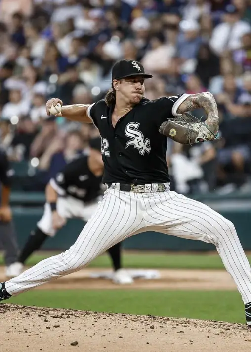
24. Chicago White Sox
Kinda loves the name of the team white Sox, but their uniform is a black jersey. So yes that’s one more catchy thing you’d look at, it has everything that you need, from the aesthetics to the combination of classic black and white, and let’s be honest you can’t go wrong with a black and white combination, no matter how much you try. It’s always gonna remain a classic and therefore it’s gonna make you feel like the uniform in general has a much more sturdy look overall, so yes it is a pretty catchy look overall. Even the cap has a super casual yet stylish design, with cursive handwriting and whatnot, it looks super stylish and adds a touch of sophistication as well.
Source: Instagram
23. Detroit Tigers
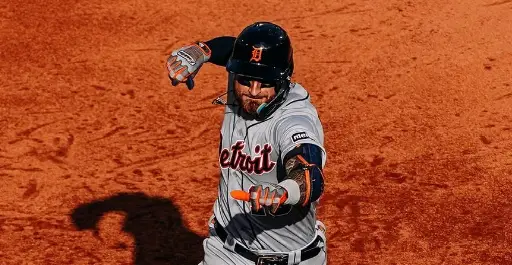
So you must be wondering something like hey you placed other plain uniforms on the top, what about the Detroit tiger aren’t they plain as well? No, they are not guys, they have that blue piping added to it, which makes it more catchy looking and as well, makes it much more stylish just in general. They are absolutely perfect and will give you this sort of feeling of simplicity and sophistication at the same time. Something like a line of silver, the uniform kind of speaks about it just like that. I like how most of their piping kind of matches their arm gloves kind of giving the entire baseball uniform a contrasting look overall.
Source: Instagram
22. Cincinnati Reds
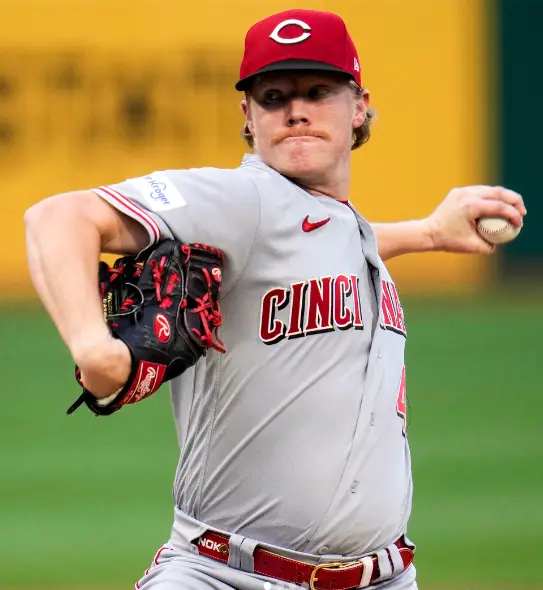
Yup so for this one, once again it’s not something super catchy and you’d be like “Oh my god yup I’ll invest my bucks into it.” No, you wouldn’t, they aren’t super great or anything. I mean yes I do love the creative way of how they put the big ‘C’ and that ‘C’ sort of encircles the red word and therefore making the team logo look much more fantastic and much cooler in my opinion. Not something that would earn a spot in the top MLB baseball Uniform. But when you put the whole outfit together, it’s not that much of a big deal, the cap looks too simple as well, with just a big encircling C that is it. All you get is that and nothing crazy as such. They do have that thing, that they have added the reds to the uniform, that keep the name of the team with color as well.
Source: Instagram
21. Houston Astros
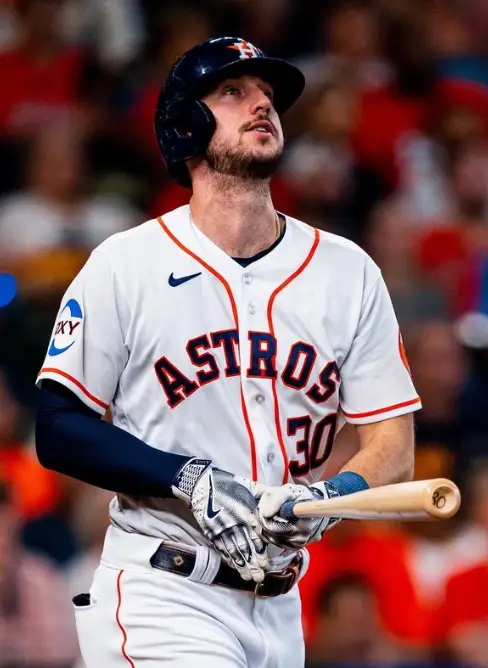
The Houston Astros…hmmm… what do you actually think when reading that. I mean yes the state of Houston and all, of course, you’d think that first. But what would be the next thing? Astros right? Astros means stars then that means the stars, yup that’s right. So honestly when you look at their baseball cap they have a star and placed a capital “H” in it. Pretty cool if you ask me and oh props to your design team! I actually do love the entire uniform honestly, they have a pop of color of orange and this dark blue that encircles most of the clothes and the entire lettering and the numbering and the orange that encircles the entire thing. Therefore this design is super great and super perfect as well. Still not worth going up to the top spot of MLB uniforms in 2023.
Source: Instagram
20. Kansas City Royals
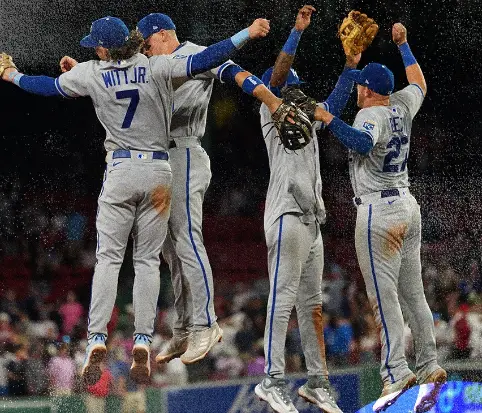
The Kansas City Royals are not the best thing that I’d love honestly, their entire thing is this blue and white theme that doesn’t have anything, I mean yes they are blue and bold which gives them a bolder look when you look at it. Looks super eye-catching when wearing the jersey, but when you look carefully at it, it doesn’t seem too great, it looks pretty much simple, they have a simpler poor blue color and they don’t have something that would actually match the aesthetics of your standard and liking, so yes the kansas city royals jersey is much more plainer than you would think it to be. So yea not a fan of the Kansas City Royals baseball uniform as well, they are just as simple as well.
Source: Instagram
19. Atlanta Braves
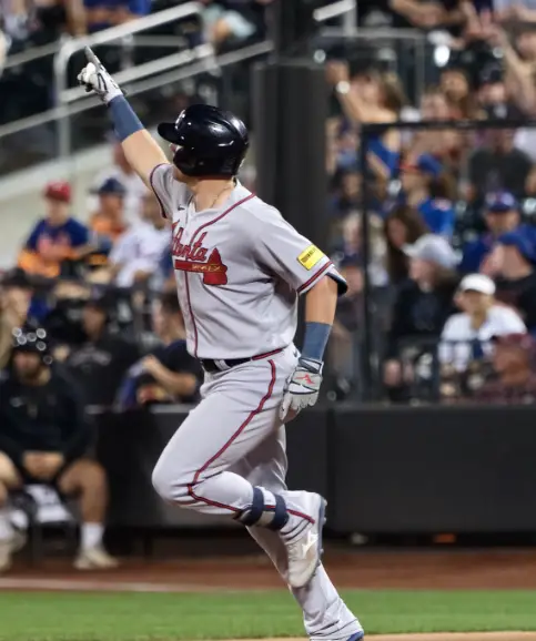
The Atlanta Braves do not have any particular type of style. I feel that just like any baseball jersey they are super simple and they just have the team name spread across the entire jersey. So that’s why it is super simple and it is also just a little bit sophisticated at the same time. I mean if you look at it carefully, you’ll notice that the logo is also placed strategically in a way that will make the entire uniform look great in a way. It’s a hammer, so yea maybe not that creative but yes, it does have some sort of flair to the entire jersey itself. So yes maybe not the best type of MLB baseball uniform but still a great piece.
Source: Instagram
18. Los Angeles Angels
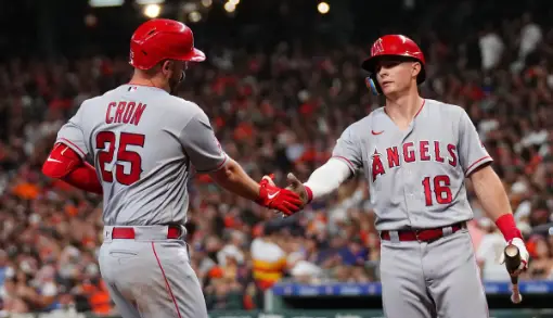
The Los Angeles Angels jersey is absolutely perfect I love how everything goes together especially the pop of color and everything else, they just sort of match with the entire jersey and give this super aesthetic type of look each time you look at the jersey, your eyes go on specific components of the entire uniform, the belt, the logo and even the baseball cap itself. All of these seem to pop the red color even more and therefore make it even more poppy in terms of the uniform style and all that. You’ll get everything that you need when looking at this jersey, especially the style factor!
Source: Instagram
17. Seattle Mariners
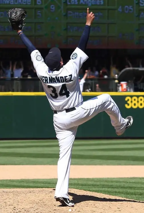
Okay, so the Seattle Mariners are placed a bit higher than most plain-looking jerseys. Am I biased? Nope, I definitely am not. The uniform is just generally, nothing out of the ordinary, they have a great style, but nothing that would exude your expectations if you know what I mean. You would want something that would look amazing and pop in terms of color as well. But the Seattle Mariners is something that would give you a more cool and fresh look, it’s actually simple and not that big as such. So there’s nothing crazy once again or something that would make it stand out just in general.
Source: Instagram
16. New York Mets
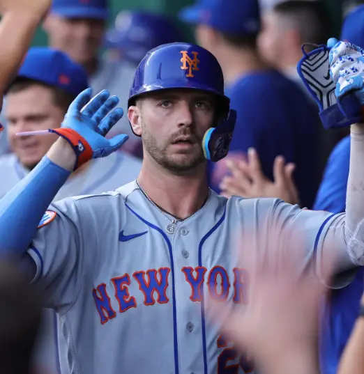
I’ll be super honest with you, but I’m not a big fan of pinstripes but for some reason, they do have some sort of aesthetic look toward it. I mean the color sort of matches in a way that makes the entire uniform look really aesthetically pleasing. I mean it doesn’t have any crazy components, nothing that you would like, yea I’d buy that, but yes the color, like the orange, and all sort of shockingly go with it somehow and coordinate to make the perfect type of fit for players. It is classic and simple at the same time, so yes it’s everything you’d actually want to see in a New York Baseball Jersey, if you get what I mean!
Source: Instagram
15. Baltimore Orioles
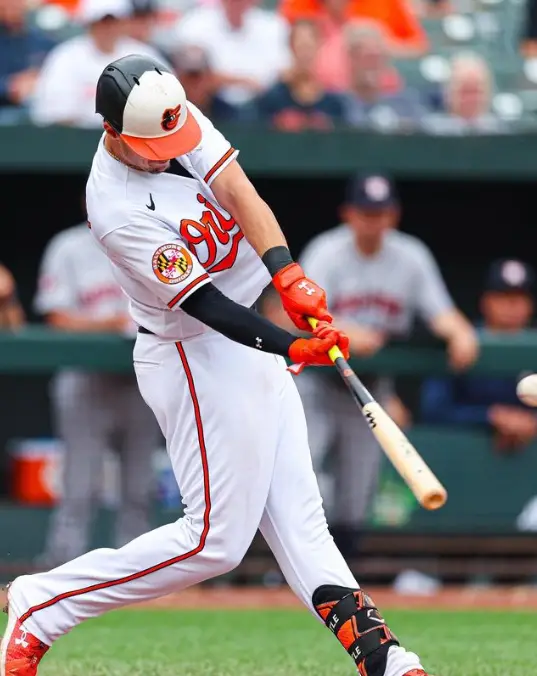
If I’m being very honest the Baltimore Orioles is super great, like the black and orange although a weird combination when thinking about it, itself sort of somehow goes together. They give this really simple yet professionally stylish look at the same time. They don’t have any of the extra properties or any of the extra crazy features that you’d expect. They have simple features and color combinations that just make them stand out according to me. Maybe that’s why it looks so appealing to the eye, maybe it’s just the way the colors are placed and everything else is done in a way to gain some popularity towards how the jersey is. But it is worth being placed as the best MLB uniform in 2023, well, we still have other competitors on the field.
Source: Instagram
14. Chicago Cubs
Well here comes number 14 on the list! And it’s no shocker, once again the design team has done it again, they’ve proved themselves right with this jersey. The uniform itself has pinstripes, which a lot might think may be boring and just plain for the sake of it, but honestly speaking the logo is giving everything! No, literally it’s super creative and super bold as well. The combination of blue and red, with conjoining “cubs” is absolutely stunning and is super remarkable in terms of the way it is designed. So yes these are actually perfect and they look also super great while giving it a tinge of style and aesthetics.
13. Los Angeles Dodgers
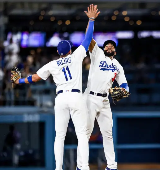
The Los Angeles Dodgers is a super great team overall, they are amazing and perfect. I mean there is the right amount of blue, not anything that’s over, you know just the type that you’d like in your typical jersey. It has a beautiful royal blue color, now why do I like it compared to other jerseys out there, well simply because these are super beautifully paired with the white, it doesn’t look too dull nor do they look too bright, they are that right amount of color and that’s why they are just perfect honestly speaking. So, yes that kind of justifies why they make it through at least halfway of the list.
Source: Instagram
12. Boston Red Sox
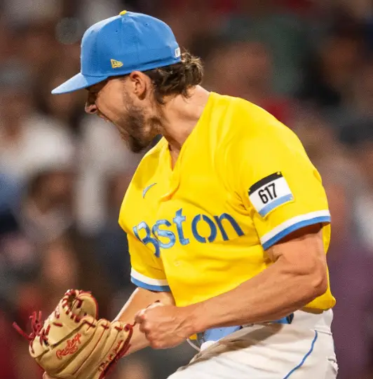
Well so the next team in line is the Boston Red Sox, yup that’s right, this is another great team. Overall, they have that super clean and beat look. I mean not anything over the top and crazy, just simplicity in its best form. Maybe that’s why it looks so attractive mainly because of the way it is simple and super easy to work with. That really great type of neatness and just the team name going through the jersey just makes it stand out more than the rest of the other types of jerseys out there. Also, the piping kind of adds another touch to it, so yes that’s another added plus point that you’d get to witness when just looking at the jersey, kind of adds the fresher look to the jersey.
Source: Instagram
11. Oakland Athletics
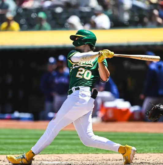
Another type of team that doesn’t need anything that colorful to look remarkable on the field. I mean just look at the uniform. It is simplistic yet super poised and elegant as well. It doesn’t have any crazy designs and sometimes there’s no need for anything immensely crazy to stand out, it is sometimes the ones with the most elegant of details that will stand out to most. Yes, the Oakland Athletics jersey is one of them, they are super chic and super. The jersey is simplistic and the green really adds that extra bit of flair to the uniform making it really soothing to the eye. The matching green arm sleeves and the team name across the jersey are absolutely perfect and give that perfect type of contrast in colors.
Source: Instagram
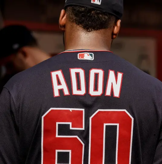
10. Washington National
Now this has landed in the top ten for a reason surely, you’d think that “Hey, this is plain too, I mean what is the difference”. Well, it might not be that hard to notice, but if you take a look at the baseball cap, it’s the small details that pique my interest. The ranking is not based on how the jerseys look or how the colors or anything are, it’s mostly based on the smallest and minute details that make the jersey more iconic than it already is. Back to the main point, if you look at it carefully, you’ll see the U.S. capitol and within that, the ‘W’ letter is placed in it, these small details are really what bring the jersey to life and give its more iconic look and just its overall feel as well.
Source: Instagram
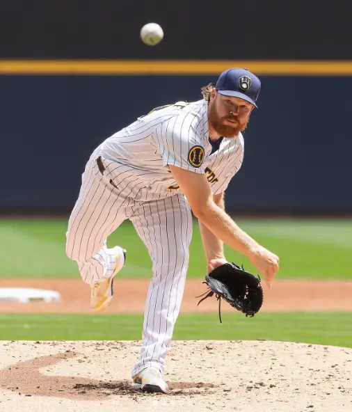
9. Milwaukee Brewers
I know I said colors don’t matter in the last review, but hear me out! Just looking at the jersey, I feel the colors really pop out the features of the players and make them all the more intimidating and powerful on the field. The blue and yellow, although a sort of weird combination, tend to look very good on them and make them stand out even more and make them look amazing just in general. The way the jersey matches the entire thing, especially with the blue arm sleeves is just the cherry on top, they have that blue and yellow, which makes it stand out perfectly and give it that sort of astounding type of look that you’d want to see in a jersey.
Source: Instagram
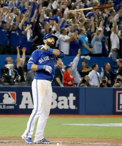
8. Toronto Blue Jays
Ahhh.. the Blue Jays, once again, design on the peak, at perfection, quite literally the best type of jersey I have seen, honestly. Blue jays are a bird if you didn’t know that and what do you get to see on their jersey, that’s right a blue jay, which represents the team’s logo. Pretty neat if you ask me I mean it has that sort of all-blue tone going on for the entire jersey. This makes them really stand out as well. The blue piping, the blue logo, the blue team name. They don’t have an overpowering blue, that will just shun your eyes away if you were to make eye contact with it, but they have the perfect type of blue that has that calm effect to look at making them really great as a baseball uniform, and overall just the type of uniform you’d want to have!
Source: Instagram
7. Philadelphia Phillies
Another team is just rocking the all-red look. I mean just look at it, it has everything that you’d want in a baseball uniform. The red belt, the red logo, and even that red baseball cap tie up the entire thing together. I mean looking at it, seems so perfect and just the type of uniform you’d want, if you are collecting uniforms of different teams or even just wanna buy an MLB team uniform. The baseball cap isn’t anything major but it is giving a lot of that contrasting features that you’d want in a uniform, the red really gives that sort of bold and confident look, which kind of gives other players a sense of how good the team is or even might be. The pinstripes paired up with red, also add that extra bit of flair, yet still gives it that remarkable type of look overall.
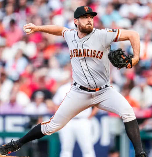
6. San Francisco Giants
Yes, the Giants, now they didn’t end up in the top five, but they sure made their way up to the top ten. That’s for a reason, once again the bold color choice is everything I mean look at the black and orange it is giving so much of that contrast that you’d think it wouldn’t have. They are absolutely perfect. They have an absolutely beautiful type of combination that is hard to understand how it fits, but miraculously pairs up together beautifully, to make the jerseys absolutely perfect. The baseball cap is also tying the whole thing up, with the letter denoting the team’s name in a perfect type of way. Yup, definitely perfect if you ask me. Is it worth your bucks, if you were to invest in this uniform? Yup, I definitely think so!
Source: Instagram
5. San Diego Padres
San Diego after San Diego is not a shocker, but the Padres ended up in the top five of this list. Reasonably so, the color combination once again is striking and who wouldn’t know the two would complement each other so well to form the best type of jersey that you’d be looking for. The black and yellow, with “padres” written across the chest, really gives you the type of thing that you’d require in a jersey. The combinations make it extremely great and of course, the baseball cap in the end just adds everything up together. So yes this would probably be a really great jersey overall because of the way it looks and is designed in an inexplicable but beautiful way.
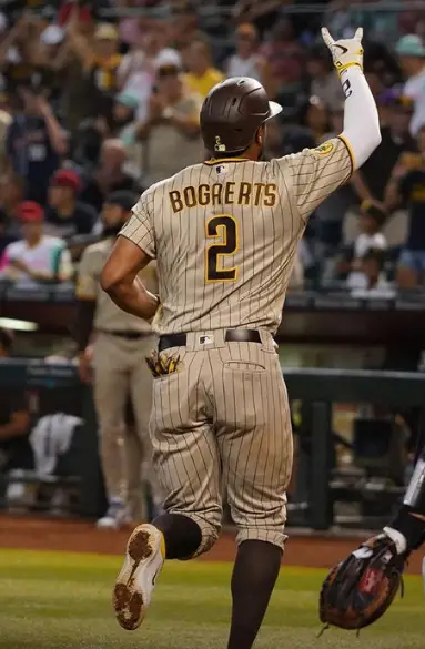
Source: Instagram
4. New York Yankees
Well next on the list is the New York Yankees and it has rightfully earned its place in the 4th position on this list. I mean you would think why or how could that possibly be, but yes it is possible. The New York Yankees have been a classic and timeless design, they have that super clean and chic, pinstripe type of design that you’d notice in every type of baseball. Timeless because if you think about it, their baseball jersey looks super old and classic, just like how it used to be back in the day so yes this is really the best type of baseball uniform overall. They will always be a timeless and classic type of jersey even throughout history.
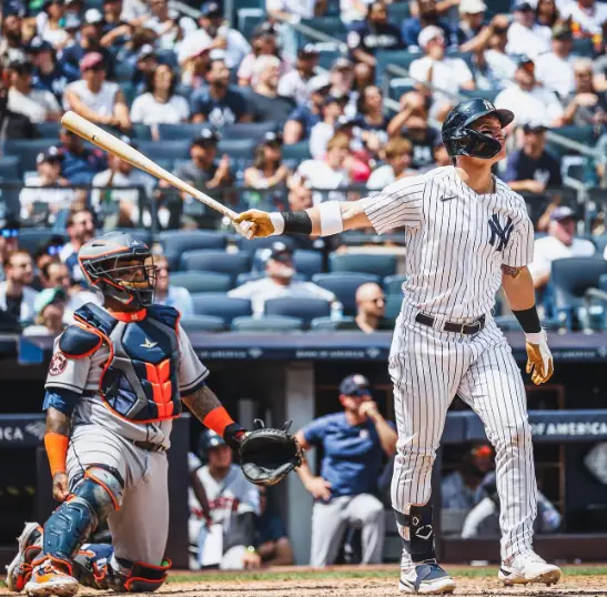
Sources: Instagram
3. Texas Rangers
No one and I mean no one can go wrong with blue and red. I mean there are so many great things that you’d see in this jersey. The blue and red significantly give this sort of classic color choice, but also once again give it a more vibrant pop of color, so yes definitely love this jersey for the way it is unique and built in a way to meet and please the eye. The Texas Rangers, as a team, have a really great color scheme, the blue baseball cap ties up the entire thing, and the capitalized ‘T’ really brings the whole thing out. The baseball cap also coordinates in a way and has a blue crown and a red visor, yup once again the color coordination is on point right here. So yes investing in these would be worth your dime.
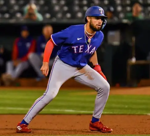
Sources: Instagram
2. Pittsburgh Pirates
Obsessed is not the word when it comes to this uniform, I mean literally like I said, I for one, am big on the design component of the entire outfit and jersey. And this has taken a close win with that. I mean of course there is the green and yellow that is just gonna add that bit of pop and that sort of color palette to it. The design is fairly simple, but what caught my eye is the logo as such. Look at it, a pirate, perfectly demonstrating the team’s name and going perfectly with the entire jersey as well. That is why when I say that the details are important it is and that is why this is literally almost one of my close favorites on the list as well.
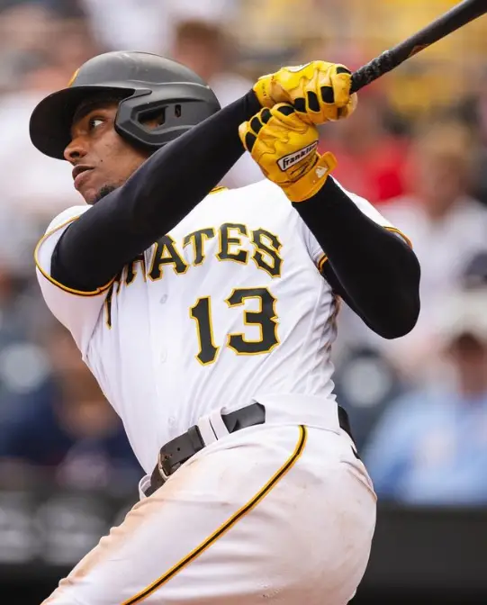
Sources: Instagram
1. St.Louis Cardinal
Well and the best MLB jersey in 2023 is and drumroll please, the number one on the list is the St. Louis Cardinal, yes it is absolutely perfect and it has everything that you’d want in a jersey. I mean look at the design it is literally awe-striking, the two birds that connect to the front of the jersey and the team’s name, the red giving a bolder pop of color look, as it should. The branch of yellow just gives an extra subtle hint of color, without drawing too much attention to it, but still making a very great statement. Everything about this jersey is just absolutely amazing and is just perfect as well. The type of jersey that you’d want to put all your money into, hell I would put my money into it as well. This jersey really is one of my favorites, because of the design, the color, and everything else with it. I would definitely get it and yes you should definitely get it too!
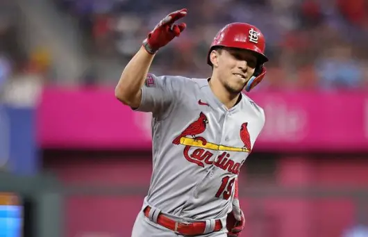
Sources: Instagram
Conclusion
And so there you have it the perfect type of list that has probably helped you to summarize everything that you must be looking for when finding the perfect type of jersey that you’d want as memorabilia, maybe to frame it as well, if you wanna check out how to frame your jersey, you can check it out here. Whatever may be the reason, I hope this article has helped you find the type of ranking that you need when choosing a baseball jersey for yourself.
